Over the course of the past several years, Pantone colors have embodied more than just shades; they have been symbolic representations of social, emotional and digital evolution. From the serene Classic Blue of 2020 to the bold Viva Magenta of 2023, each color has woven a unique story on the canvas of contemporary culture.
2020: Classic Blue
PANTONE 19-4052
The 2020 Classic Blue became a beacon of stability and confidence in an uncertain landscape. Beyond being a simple shade of blue, it embodied a profound sense of calm and serenity in a world overwhelmed by turmoil. Inspired by the vastness of the evening sky, this shade was selected for its ability to convey a sense of security and universal connection.
Chosen as a timeless shade, Classic Blue resonated with a quiet elegance and striking simplicity. As global challenges intensified, this color offered an emotional refuge, providing respite from the chaos. Its presence evoked a sense of peace, encouraging focus and reflection at a time when an overabundance of information threatened to overwhelm.
In addition, this shade not only represented visual stability, but also embodied emotional and psychological stability. When immersed in Classic Blue, people found the clarity to focus their thoughts, which translated into a drive toward resilience and adaptation in the face of unexpected challenges.
This iconic shade, gentle in appearance, yet deeply meaningful, proved to be an emotional anchor for many, offering a sense of familiarity and hope in an ever-changing world. As a constant reminder of trust and connection, 2020 Classic Blue remains an enduring testament to color's ability to influence our emotions and give us the strength to face the challenges of the modern world.
2021: Ultimate Gray + Illuminating
The year 2021 witnessed a unique and symbolic combination: Ultimate Gray + Illuminating. This chromatic fusion was much more than the union of two independent shades; it represented the harmony between solidity and luminosity, reflecting the complexity of human emotions and contemporary realities.
Ultimate Gray
(PANTONE 17-5104)
Ultimate Gray embodied stability, durability and strength. Inspired by the durability of weathered rocks and the solidity of natural elements, this shade conveyed a sense of reliability and security. It evoked calm and composure, reminding us of the inherent strength found in simplicity and stability. It symbolized the ability to withstand and overcome challenges, providing a solid foundation on which to stand.
Illuminating
(PANTONE 13-0647)
On the other hand, Illuminating radiated energy, vivacity and optimism. Like a sunny glow, this bright yellow symbolized hope, joy and vitality. It was a reminder of the promise of a new dawn and the search for bright moments in challenging times. Its vitality stimulated creativity and mental clarity, instilling a sense of positivity and an optimistic view of the future.
Ultimate Gray + Illuminating
The union of Ultimate Gray and Illuminating in Color of the Year 2021 was not only an aesthetic combination, but also a visual representation of the coexistence of serene strength and hopeful luminosity in the midst of adversity. Together, these colors conveyed a message of balance, a call to find stability within luminosity, and an invitation to embrace resilience as we venture into a future full of promise and possibility.
2022: Very Peri
PANTONE 17-3938
The year 2022 brought with it the enchanting Very Peri, a shade that captured imagination, originality and a fresh perspective on an ever-evolving world. This color, a fusion of purple with hints of blue, was not only visually captivating, but also embodied a fearless attitude toward creativity and change.
Very Peri symbolized the ability to embrace the new and innovative. Inspired by an inquisitive curiosity, this shade represented the tireless search for new perspectives and the willingness to challenge established boundaries. It reflected a willingness to experiment and explore uncharted terrain in art, design and everyday life.
2023: Viva Magenta
PANTONE 18-1750
The year 2023 greeted us with Viva Magenta (PANTONE 18-1750), an energetic shade rooted in the red family that burst onto the scene with vitality and boldness. More than just a color, Viva Magenta became a symbol of strength, celebration, and boldness. This vibrant hue conveyed an exuberance that promoted optimistic joy and a narrative of unfettered self-expression.
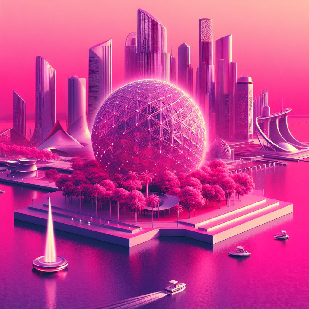
The concept of the metaverse, an expansive and shared digital reality, gained prominence during this time. Viva Magenta became a symbol of the merging of physical and digital life, reflecting the growing interaction between real world and virtual experiences. This color represented the dynamic relationship between society and technology, as well as the growing importance of identity and self-expression in digital environments.
Viva Magenta of 2023 was not only a vibrant and joyful color, but also a reflection of inner strength, the celebration of individuality and the integration of digital experiences into our daily lives. It was a call to embrace authenticity, experimentation and boundless joy, challenging conventional perceptions and ushering in a new era of diversity and self-expression.
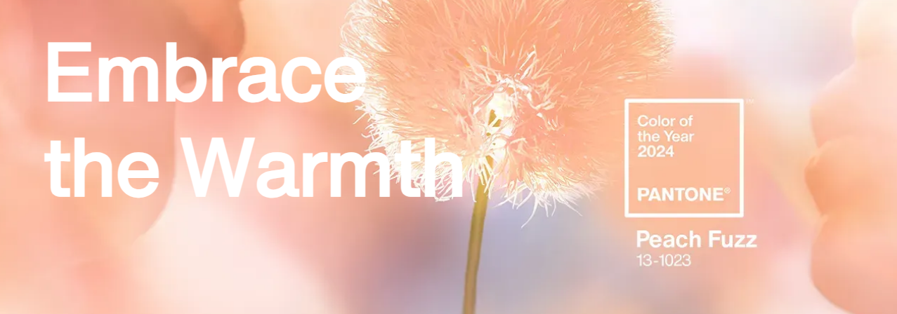
2024 ...
PANTONE
In this chromatic journey over the years, each Pantone color has been a chapter in the history of our culture, reflecting the changes, resilience, and adaptation of our society. Now, as we eagerly await the announcement of Color of the Year 2024, we prepare to welcome a new color narrative, eager to discover the hue that will embody the next chapters of our visual and cultural history. We embark on the Magentaverse, ready to embrace the energy, creativity and diversity that await us in this next color adventure.